When Tomb Raider—the reboot of the game franchise with which it shares a name—came out earlier in March, many a column inch was devoted to Lara Croft's evolution from archaeological adventurer to concerningly capable killer. Rather fewer were given over to the use of apocalyptic artwork, invisible cameramen, birth metaphors, and emotional color palettes. To redress the balance, Wired.co.uk quizzed Brian Horton, Senior Art Director at Crystal Dynamics, on all of the above and then a little bit more.
The Tomb Raider games are iconic—how do you even get started reworking a game with such a strong visual legacy?
As a fan of the classic games, I played Tomb Raider 1 and 2 again to remember why I loved them so much. Lara Croft was a confident and totally capable anti-hero, but she didn't have much room to grow in ability or characterization.
Our concept was a simple one that allowed us to rework Lara's look and abilities; an inexperienced Lara Croft on her first expedition, her ship crashes on an island and she must do whatever it takes to survive. To believe in this survival story, we grounded Lara, and her world, making both as realistic as we could.
We removed Lara's experience and confidence but we retained her intelligence, curiosity, and determination. These changes gave us room to allow her to grow as a character. It was exciting and scary at the same time, we knew it would be a bold change for Tomb Raider and we were happy with the positive reception when we announced the reboot in 2009.
OK, so in terms of Lara herself, how did her look progress and how did you know when you'd got it right?
Lara's look took a lot of exploration and iteration. Lara went through many incarnations, at one point she had a more classic look with a young girl as a companion—she even had a monkey as a helper in one version!
Brenoch Adams (Art Director) and I went through the design process together. We were inspired by characters in films and TV, like Ellen Ripley from Aliens, Kate from Lost, John Rambo from First Blood, and even John McClane from Die Hard. All of these heroes relate to a common theme; they are real people in a horrible survival situation. They get hurt and express emotion, but find the inner strength to keep moving and prevail.
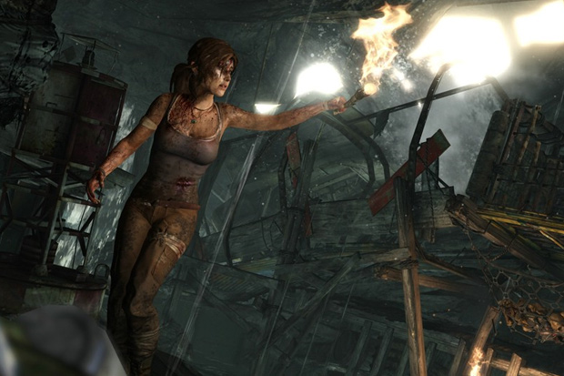
We wanted this young Lara to look like a girl you knew while retaining some of the iconic qualities of Lara Croft. We made her body frame more petite, her face less chiseled, and her clothes are practical, with dual tank tops, cargo pants, and boots. We retained some iconic elements, like her brown eyes, her "M" shaped upper lip and the ponytail. We did a focus test on the final concept and it tested very well, most people were more drawn to her face than they were to her body.
To bring the concept to life, we purchased real clothes and hired two models to scan, one for the body and one for the face. This was just a foundation for us to achieve the believability, our Principal Character Artist, Kam Yu, refined this data over the course of a month to finalize the model you see in the game today.

There were hints of The Hunger Games and Katniss Everdeen in Lara's look too although I gather that was coincidental. Do you think they both tap into a how we are trying to portray women at the moment or is it something else entirely?
We weren't even aware of The Hunger Games when we finalized Lara's look and the bow as her new signature weapon.
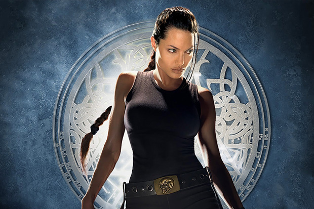
I do think this happens in our culture, where themes emerge from different places and seem to connect. We feel Lara is one of the most influential female heroes in all media, but we knew the 90s represented different values for a hero. Our interpretation is in line with what we like to see in our heroes today, flaws are as important as strengths.
In terms of visual reference points what were your inspirations, either in terms of other games or in terms of artworks? I thought I detected a touch of John Martin apocalyptica in the opening sections...
For inspiration we looked at movies like Apocalypse Now and The Descent. They have a dark beauty to them that we wanted to capture in Tomb Raider. The John Martin painting is amazing and while not an immediate reference, it was in line with the paintings we were inspired by from Turner, Bierstadt, and Church. They created some of the most amazing natural wonders that look beautiful but ominous; showing how nature can be scary. These influences were the foundation of bringing personality to the island of Yamatai.
How did you reflect the "Survivor is Born" theme visually?
The beginning of the game is kind of a metaphor for her birth; she struggles out of the darkness of the caverns and emerges to the light of the cliff side. This is her birth, she's thrust into this situation and she can't go back. Her evolution through the game is a continuation of this journey, she has to confront her fears and keep moving forward.
As well as the sympathetic geography, changes in color palette are linked to Lara's character evolution. Could you explain a bit more about how that works?
We use color as a way to express emotion. These colors will change and evolve throughout the story to reflect Lara's state of mind. For instance, we start the game in cool tones—the fire is the one source of light and warmth, and this represents the player's hope, as well as a tool for survival. Then at the end of the level we take away the fire as she scrambles up the muddy incline, a pinhole of light closes in as the cave starts to crumble until we go to black. When Lara emerges she's bathed in warm light.
It's a deliberate color choice to provide relief and accomplishment. The audio team takes these cues to create music and sound that complement these emotions perfectly, with dissonant percussion in the caverns, and a piano as she emerges onto the cliff path.

I noticed you used a fair amount of lens flare and water effects—why do you think we like to be reminded of a camera that technically doesn't exist?
We wanted this game to be presented as if it were a documentary of her first adventure. Effects like lens flares, dirt, water, and blood splashes on the lens add aesthetics to this documentary, further immersing players into our fictional world. Remi Lacoste is the genius behind the cinematography in this game and his camera performance complemented this vision and brought the virtual cameraman to life.
How did you translate the violence and emotion of the first kill into a visual experience?
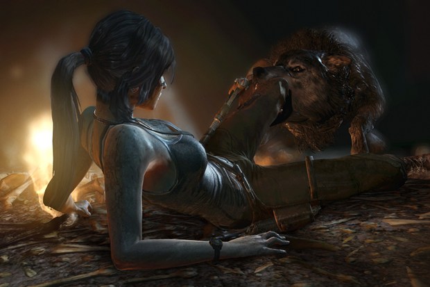
We wanted to express the gravity of death through gameplay. We started this with a deer, which Lara has to kill to survive. She has empathy for the deer before she harvests it for food; it's a sacrifice she has to make to survive. When she's confronted with wolves, they will not hesitate to kill Lara so she must take an aggressive stance to survive them. Finally, we present the player with a human, but a sadistic, amoral enemy: we deliberately want the player to feel disgust, and a palpable sense of menace.
The moment where Lara has to kill a human for the first time must feel justified, but also powerful and revelatory: this moment changes her, and from that point on she and the player understand that killing is the only way she can survive the insanity of this island.
Were there any ideas you loved but couldn't make work?
There are a lot of ideas that we really like that didn't make the game. Some of them would fit into the new format, some, while cool, will never quite work. For instance we had an epic battle on the beach level that had Lara fending off a siege of Solarii with a mounted machinegun. While fun, it didn't really fit her character and upped the kill count to unrealistic proportions. We spent a lot of time on it, but cut it because it didn't fit the game.
What are you proudest of in relation to the game?
The team is proud of the game we made. Even before it hit retail we knew it was the best game we could make. We sacrificed time away from family to ensure it was true to our vision, looked great, and was fun to play. This kind of game doesn't come around often, and I'm honored to have been a part of it.
http://arstechnica.com
No comments:
Post a Comment